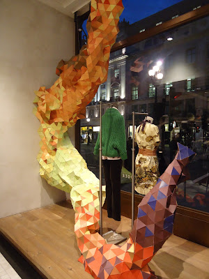
When entering Regent Street’s Anthropologie store decorative excess hits you immediately with multicoloured chandeliers, grass covered walls and vintage style ornaments. Arguably distracting your eye from the clothes, the shop presentation felt relevant to the collection however overpowering and dominant.
Within the shop window and when entering the doors, large sculptures and patchwork draping set the mood of textural extravagance which spiralled up and down large open plan staircases to two extra floors. Focusing on a shopping ‘experience’, Anthropologies’ clothing plays with a mix of many different styles, themes and trends varying from knit, vast amounts of colour and an older style of print and pattern. This provides a great deal of choice but a signature style is lacking. Upon being greeted into the store with enthusiasm by staff, customers appeared to enjoy the experience of Anthropologie but it was obvious that an equal amount of time was spent observing the decoration of the store as there was on the clothes.
Un-daring, sophisticated and mature clothing is displayed within the store and for an older audience the clothing is conservative with a punch of colour and averaging at a price of £150 for coats, trousers and dresses. Elements of interest can be seen in the texture of pieces like gathering, weaving and knit work, creating a very organic look and feel. Print was used quite frequently throughout the store however unlike Missoni no real trend or them within the print was evident. Missoni’s look was immediately created by the clothing and a graphic energy was obvious, however, Anthropologie in my opinion relies more on the interior of the store to make what is on sale appealing.
The shop windows sculpture and two largely suspended chandeliers of many different colours accompany you when walking up to the first floor of the shop and reminded me of an exhibition I saw at Haunch of Venison in London. Joana Vasconcelos’ exhibition uses a mash up of bright, bold and clashing colours that build up an abstract and distorted ‘sculpture’ which was suspended from the ceiling. Quant objects like books and buckets were dotted around the store creating a very vintage and reusable feel and slogans like ‘use it up wear it out, make do or do without’ supported this. The bottom floor of the store contrasts to the other two as only home collections and ornaments were on sale, distancing it to the rest of the store.


No comments:
Post a Comment